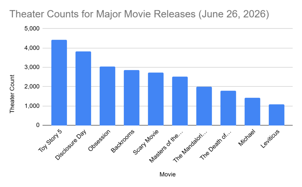
For this Daily Create, I used a bar chart to show data from previously established research. I chose to use a bar chart because it felt like the clearest way to highlight the differences between the values. In class, we looked at examples of really poor data visualizations, and that helped me understand what makes a chart confusing or misleading. Connecting this to Mayer’s multimedia learning theory, a simple bar chart reduces unnecessary cognitive load by avoiding extra visual clutter and keeping the focus on the actual information. Mayer emphasizes that learners process information better when visuals are clean, purposeful, and not overloaded with irrelevant details. That’s exactly what I tried to do; keep the design minimal so the viewer’s working memory is focused on the data itself, not on decorative elements.
One part I didn’t expect was how difficult it would be to find raw data that wasn’t already visualized. It took time to locate a credible source that provided numbers I could actually use. After a bit of a scavenger hunt, I decided to go with the theatre counts for major movie releases, since that information was available in a simple numerical format. I used Google Sheets, entered the data into two columns, and then used the Insert and Chart option to generate the bar chart.
Overall, I’d say that finding the information was the biggest part of the task. It made me realize how intentional you have to be when choosing the right mode of data visualization. This connects directly back to class discussions: the chart isn’t just about displaying numbers, it’s about supporting understanding. Mayer’s theory really clicked for me here, because the whole point is to design visuals that help the viewer learn without overwhelming them. A bar chart fit my dataset and kept everything straightforward, which is exactly what good multimedia design should do.
Leave a Reply
You must be logged in to post a comment.